
Dream Factories at Museo del Design della Triennale | Milan | 2011
Museo del Design della Triennale
Milan
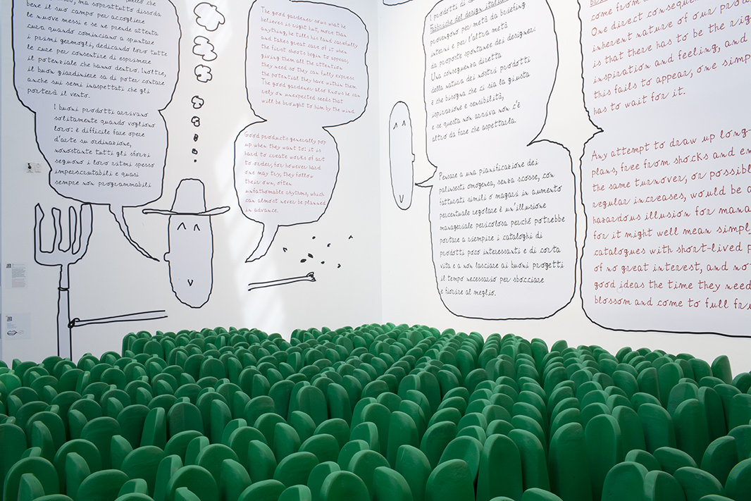
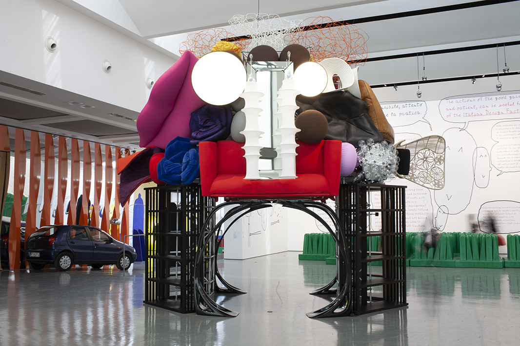
4th April 2011 - 26th February 2012 When Alberto spoke to me about the Design Museum exhibition, just before Christmas 2010, I thought I liked the idea of talking about design from the perspective of industry—in the way that as designers we are dependent on manufacturing companies—as it plays a highly relevant role in collaboration with creators or designers. Usually the character and attitude of a brand or industry is perfectly visible in the produced goods. In this case, industry perspective is very personal, set between experience and theory, but all very Alberto Alessi. For that reason a drawing of Alberto’s head is present everywhere. He explains, quotes, and tells us about his design world both in the catalogue and in the exhibition. He is not only present as a picture; we also find his handwriting digitalized and composed in a script, the “Alb Script.” A given condition was to create a sort of fabled world, he said, between Alice in Wonderland and The Little Prince, a place you enter into through a hole or a cave, the world of the dream factories. I imagine the idea is to emphasize that these kind of factories are not really dealing with real, banal functions but with ideal dream worlds and perceptions; and also, in my opinion, that they should thus not be so boringly technical with all their marketing and technical theories and content. Finally, as a morale and endpoint, there is Alberto’s theory of the good gardener, which uses the garden metaphor to refer to the owners of the design manufacturing companies, the designers being the plants and the designed objects and goods, the fruit, thus once again playing with the objects of the exhibition. We used the Pratone to visualize the garden along with a head of Arcimboldo: the design pieces are seen as a reference to a figure made by the fruit of the Italian Design Factories, representing them iconographically, and as a symbol of the possibility of entering into the exhibition through its mouth. The “captains,” the entrepreneurs, are displayed in full-size totems along the line of pieces. These totems show a portrait of the person with a drawn body (manifesting their shining aura and presence), while on their backs we find basic important data about the history and relevance of the company, including an intuitive graphic symbol about turnover. More layers in the layout of the exhibit are related to the borderline theory, which is Alberto’s idea of considering flops and bestsellers at an equal level of importance, with sometimes flops being better than bestsellers. In fact, both of them help build an imaginary line, the borderline, which is present in a subliminal way in the exhibition. The orientation of the pieces exhibited, their position in relation to the walls, defines the status of that piece in relation to the borderline theory. There is an alignment made of mostly furniture pieces that creates a kind of huge lounge of the Italian dream factories. Most of these pieces are there free to sit on or touch. Only small pieces are under glass protection, while prototypes are placed on a podium. Thematic areas are grouped by means of an icon in the form of monsters or, let’s say, big figures, which create a rhythm of twelve zones. This is transferred into the catalogue by chapters which organize and structure the different thoughts of Alberto. All the content and the selection of pieces and companies was made by Alberto Alessi. My work consisted in communicating as well as possible the attitude and the spirit that Alberto transmitted to me in relation to his knowledge and theories, and all I did was shape them into an exhibition and a catalogue. The catalogue is the compilation of all the texts and theories, the pictures of the exhibited pieces, and the files of the entrepreneurs. The images in the catalogue also show the relevance or success of a piece in a subliminal way, as a repetition or not of its picture. Texts and diagrams are represented as a sort of manuscript, or sketch.
Exhibition layout concept and design, hand graphics
Martí Guixé
Idea coach
Inga Knölke
Applied graphics, catalogue layout and design
Graphic designer Jenny Chih Chieh Teng
Exhibit layout
Architech Juan Carlos Corrales
Head of Arcimboldo layout
Interior designer Mireia Soriano
Photo Inga Knölke 2003

